One year of PaperPict: what we learned about figures
Eleven months, six tools, and a lot of figures. Some of what we learned we expected. Some of it we didn't.
Read article →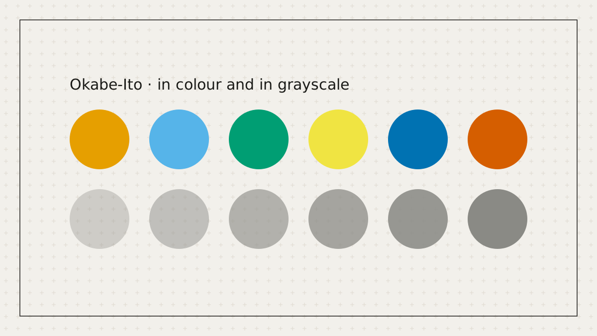
When a figure distinguishes more than two categories by colour and the user has not chosen a palette, PaperPict now defaults to Okabe-Ito. Journal palettes remain a click away, but the safe set is what you get when you do not think about it.
The palette, designed by Masataka Okabe and Kei Ito, contains eight colours chosen so that they remain distinguishable under protanopia, deuteranopia, and tritanopia simulation. It has become the most widely recommended safe set in the life sciences and is the default in several plotting libraries.
Beyond the palette, the generator pairs colour with a second cue wherever categories are compared: line style, marker shape, or a direct label. If the figure still reads in grayscale, it reads for everyone. Our grayscale preview is one click in the editor.
For continuous data we no longer offer rainbow or jet colour maps. Sequential data uses perceptually uniform maps; diverging data uses a two-hue scale through a neutral midpoint. This matches what Nature, Cell, and PLOS recommend.
Everything. Choose any palette, set any colour on any element. The defaults are safe; the choices remain yours. The colour-blind-safe checklist in our guides covers the full set of practices.
MORE FROM THE BLOG

Eleven months, six tools, and a lot of figures. Some of what we learned we expected. Some of it we didn't.
Read article →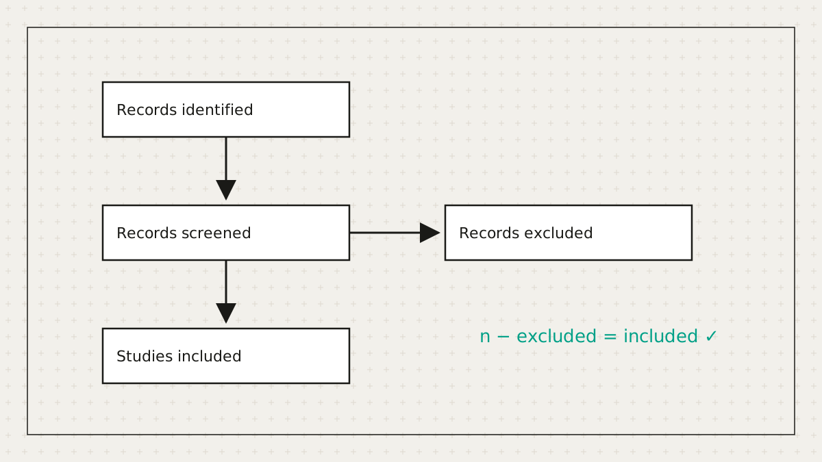
Systematic reviewers lose hours to a diagram whose main job is arithmetic. So we did the arithmetic.
Read article →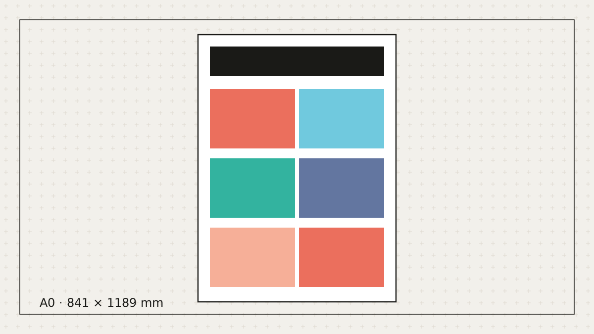
Let's be honest: most posters get made the night before. Here's how to make a good one in the time you actually have.
Read article →Free to start. No credit card. Every element stays editable.