PRISMA flow diagrams that balance: the new PRISMA 2020 tool
Systematic reviewers lose hours to a diagram whose main job is arithmetic. So we did the arithmetic.
Read article →
We set out to build a generator and found out we had built an editor. Almost nobody exports the first draft untouched; people retype a label or two, nudge an arrow, sometimes regenerate one panel. The first draft matters, but the fact that it can be edited is the reason people keep using it.
We expected text prompts to dominate. Instead, uploading the paper quickly became the usual way to start a graphical abstract, and a very common way to start a mechanism diagram. Given the choice, researchers would rather point at the document than describe it.
People switch whole palettes far more often than they pick individual colours, and the reason is rarely taste. It's usually to make a second figure match the first, or to move a paper to a different journal after a rejection.
Editable PPTX was a side feature at launch. It turned out to be one of the most requested exports, almost entirely because of co-authors and talks.
Our first poster templates were too dense, and our early defaults encoded categories by colour alone. Both are fixed: type minimums are enforced, and Okabe-Ito is the default when colour carries meaning.
Custom lab palettes are shipping to all Lab plans, the phylogenetic tool gains circular layouts, and we are working on figure checks against specific journals' author guidelines before export. As always, we will write about it here — and about figures in general, because the craft matters more than the tool.
MORE FROM THE BLOG
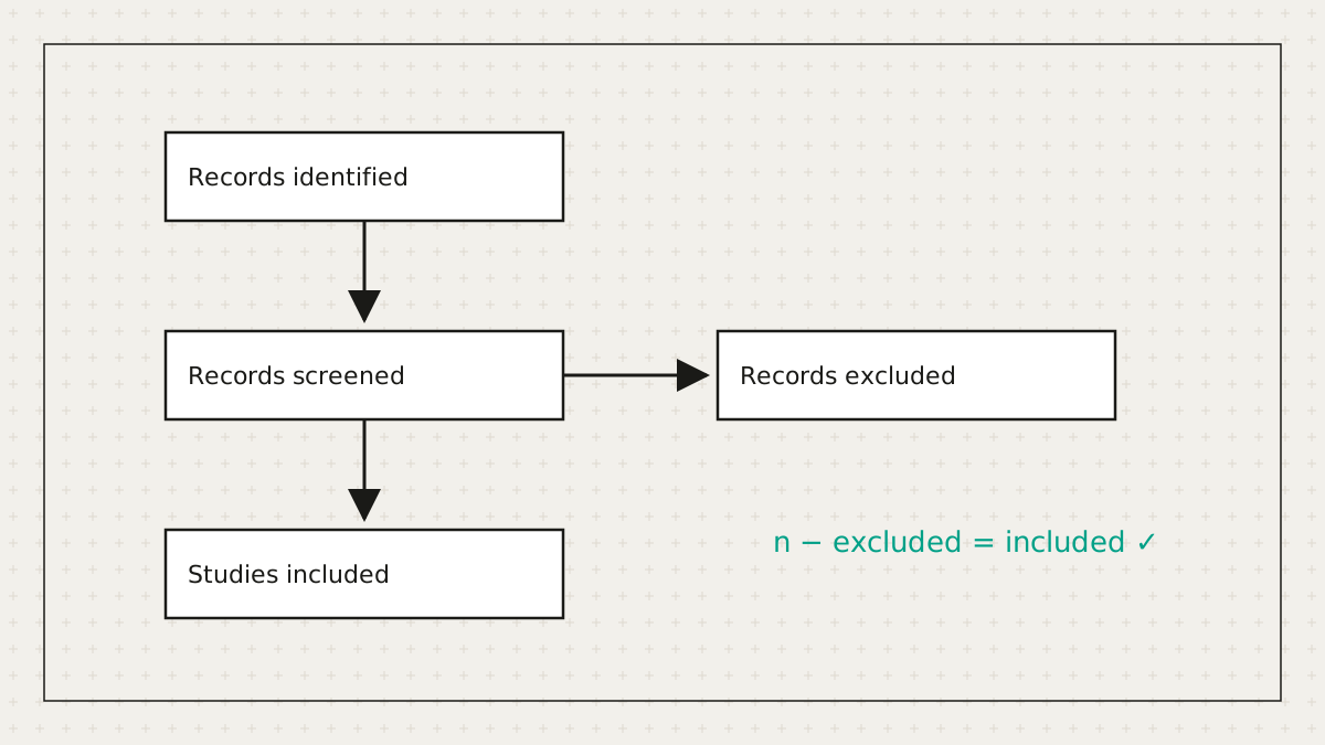
Systematic reviewers lose hours to a diagram whose main job is arithmetic. So we did the arithmetic.
Read article →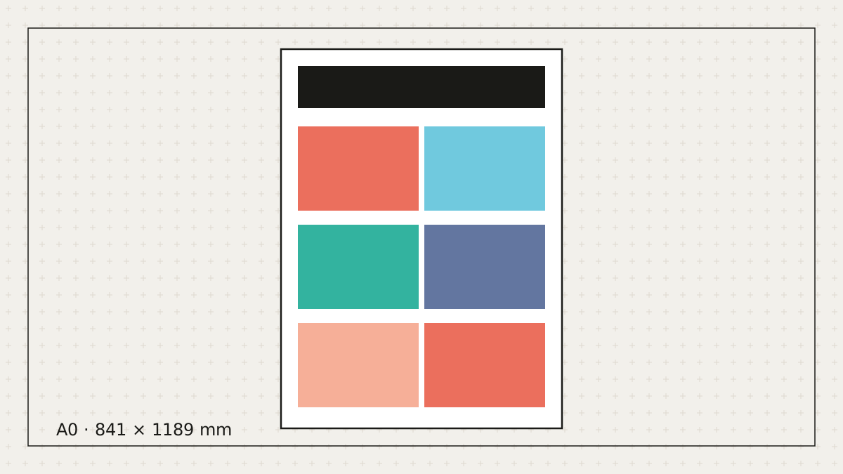
Let's be honest: most posters get made the night before. Here's how to make a good one in the time you actually have.
Read article →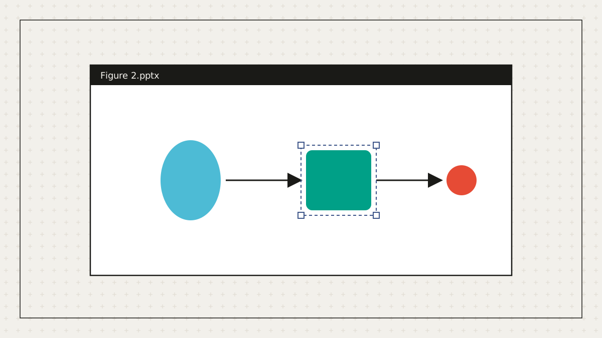
Not everyone on the author list owns a vector editor. Everyone has PowerPoint.
Read article →Free to start. No credit card. Every element stays editable.