One year of PaperPict: what we learned about figures
Eleven months, six tools, and a lot of figures. Some of what we learned we expected. Some of it we didn't.
Read article →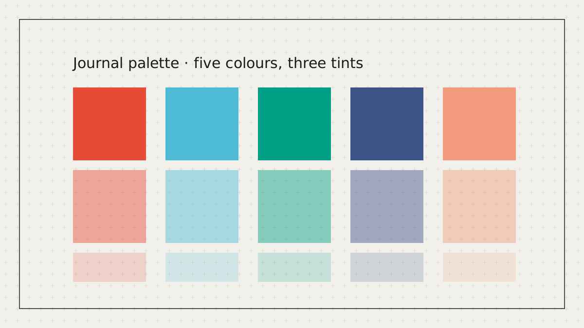
Nature, Science, NEJM, Lancet, and JAMA each have a house style visible across thousands of published figures: a handful of saturated hues, consistent tints, and neutral greys. The R package ggsci documented these sets for plots; we extended the same colours to illustrations so a mechanism diagram and its accompanying chart share a palette.
A palette in PaperPict is five base colours, three tint levels each, and rules for what gets which role: primary entities take base colours, membranes and compartments take light tints, and arrows stay ink. Applying a palette therefore changes the whole figure coherently rather than recolouring shapes at random.
Because every element carries a role rather than a fixed colour, switching from Nature to Lancet is a single change. The same figure can be submitted to a second journal after a rejection with the palette swapped and nothing else touched.
When in doubt, choose Okabe-Ito. It was designed so that all colours remain distinguishable for people with the common forms of colour vision deficiency and it is recommended by several publishers. We ship it alongside the journal sets and suggest it whenever a figure encodes categories by colour alone.
Lab plans can define their own set — the group's colours for a recurring cell type or treatment arm — and apply it to every figure the lab makes. Consistency across a thesis or a series of papers is the point.
MORE FROM THE BLOG

Eleven months, six tools, and a lot of figures. Some of what we learned we expected. Some of it we didn't.
Read article →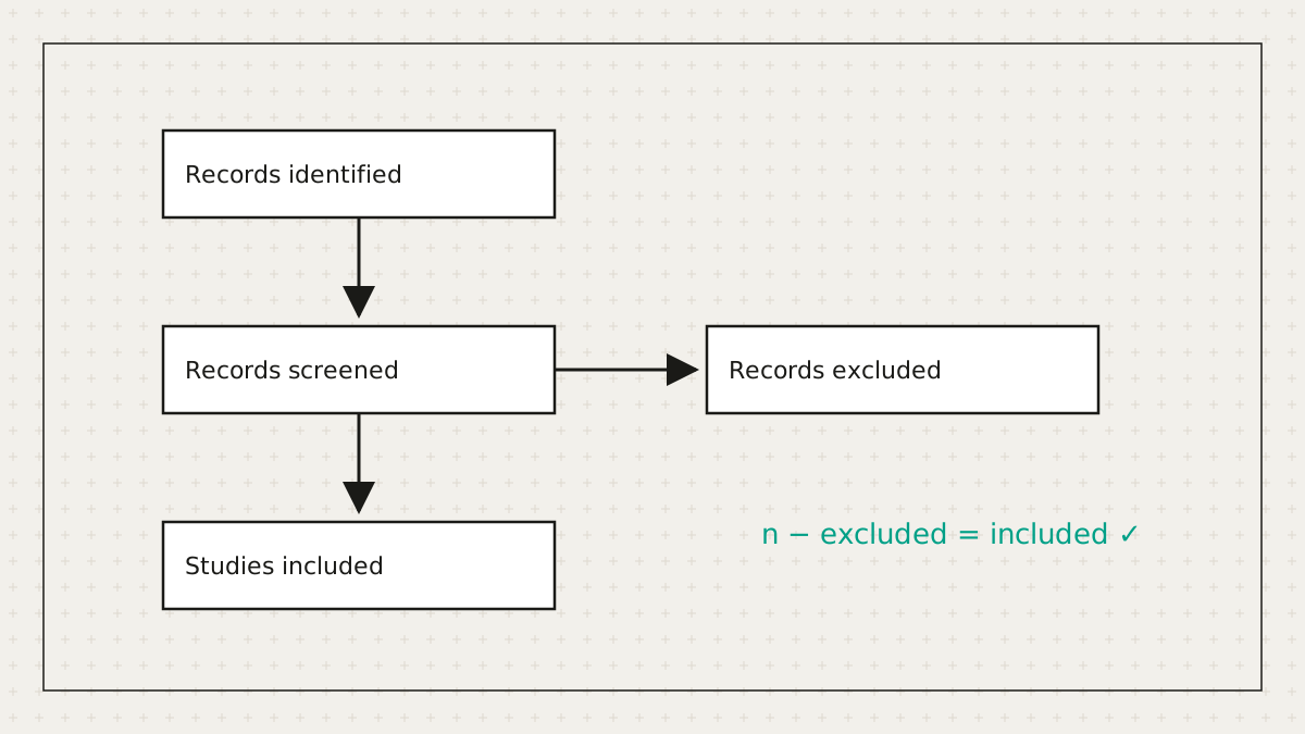
Systematic reviewers lose hours to a diagram whose main job is arithmetic. So we did the arithmetic.
Read article →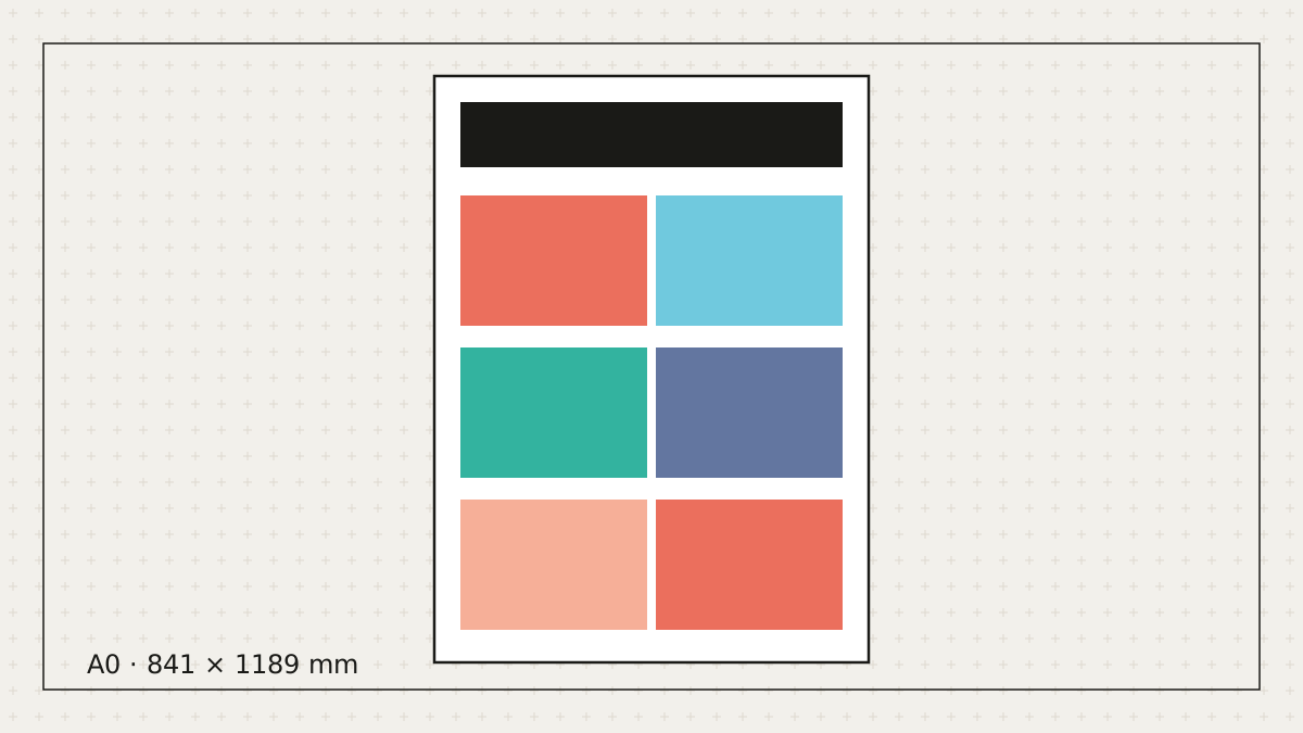
Let's be honest: most posters get made the night before. Here's how to make a good one in the time you actually have.
Read article →Free to start. No credit card. Every element stays editable.